Transforming a dated website into a modern hub for information about biosimilar medicines
We designed a new website to help the advocates for generic and biosimilar medicines and drive engagement with their users and bring their brand to life.
A site review for the Boston-area dance school to facilitate a website enhancements roadmap.

We were contacted by Boston Lindy Hop in search of a heuristic review of their existing site that gave clear recommendations for ways to:
I was a freelance UX Consultant brought on to identify problems and propose an optimization roadmap.
This project took place over 4 weeks in 2016.
Heuristic Analysis, Personas, Usability Testing, Content Strategy, Roadmapping
We created three personas that guided our review process. Each persona was based on information gleaned from interviews with stakeholders who had access to CRM data.
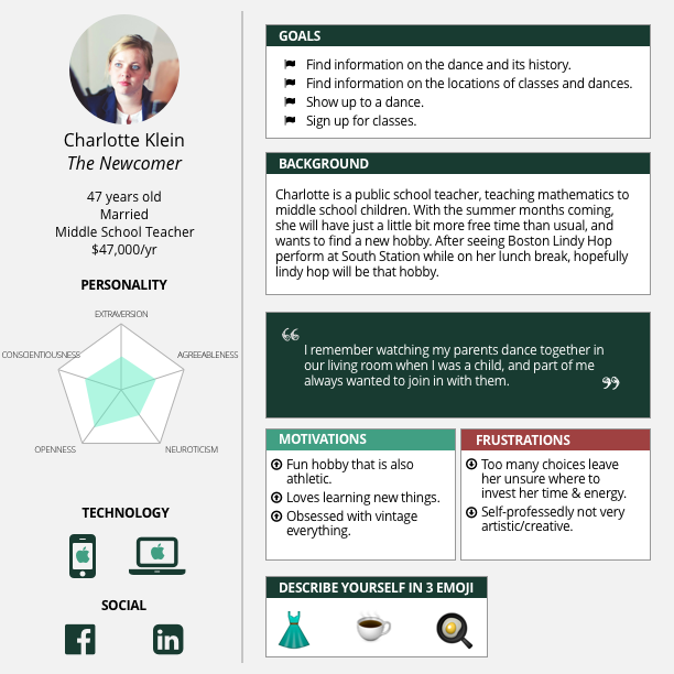
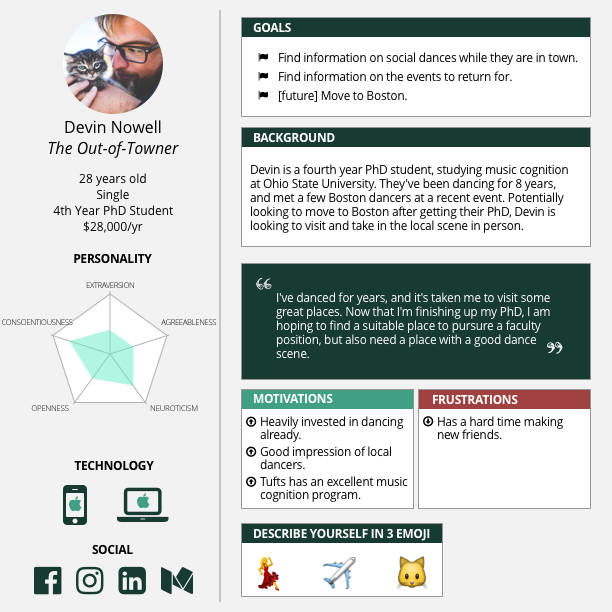
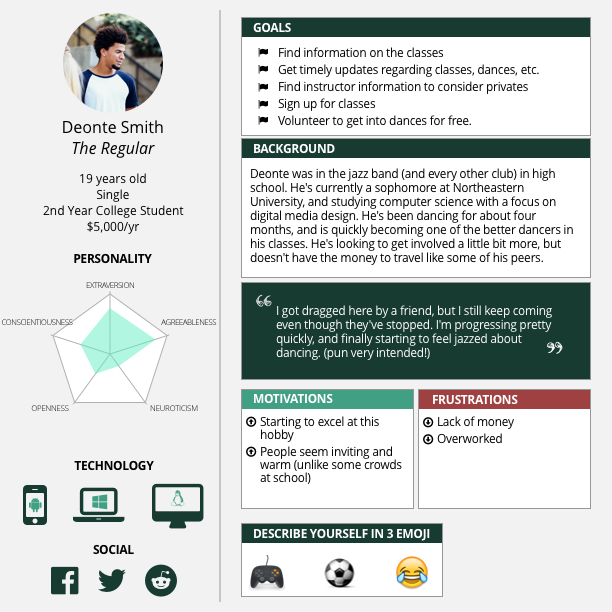
We identified three key heuristics (navigation, content, functionality) and reviewed the site with those specific topics in mind. Afterwards, we went back and reviewed the site a second time, looking for a more holistic site review to get anything we missed earlier.
Overall, the site was fairly informative, and focused on getting more newer dancers to begin taking classes. The site's navigation could orient new users to the relevant information easily, with visual infographics to help newer students choose their level for classes and guide regular customers who've already decided on a class to the sign up page simply. However, most information relevant to the out-of-towner was buried several levels deep in the information architecture, such as information on special events, any other local dances
Additionally, we focused on the functionality of the class registration forms, noticing that users signing up for classes were not given reminders of the classes they were signing up for on the registration page, despite being given the option to register for multiple at once, and some other minor issues.
With our three personas, we found two users per group, and conducted short usability tests to determine how they interacted with the existing website. Participants received their choice of food or drink for their time.
Placed on the homepage, participants were first given the freedom to click around as they would normally and asked to give their overall opinion of the site. Next, they were given tasks to complete that were relevant to the goals listed for each persona.
Here, we used both first-click testing, and a stopwatch to see how long it took them to complete the tasks.
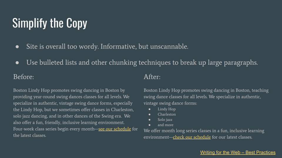
Overall, the copy on the Boston Lindy Hop website was descriptive and informative. However, usability testing participants felt it was too wordy and struggled to pay attention.
As part of our recommendations, we suggested Boston Lindy Hop review their copy, and provided them with a brief document outlining some best practices in writing for the web alongside live examples of their web copy to help them make their content more approachable by new dancers.

We designed a new website to help the advocates for generic and biosimilar medicines and drive engagement with their users and bring their brand to life.
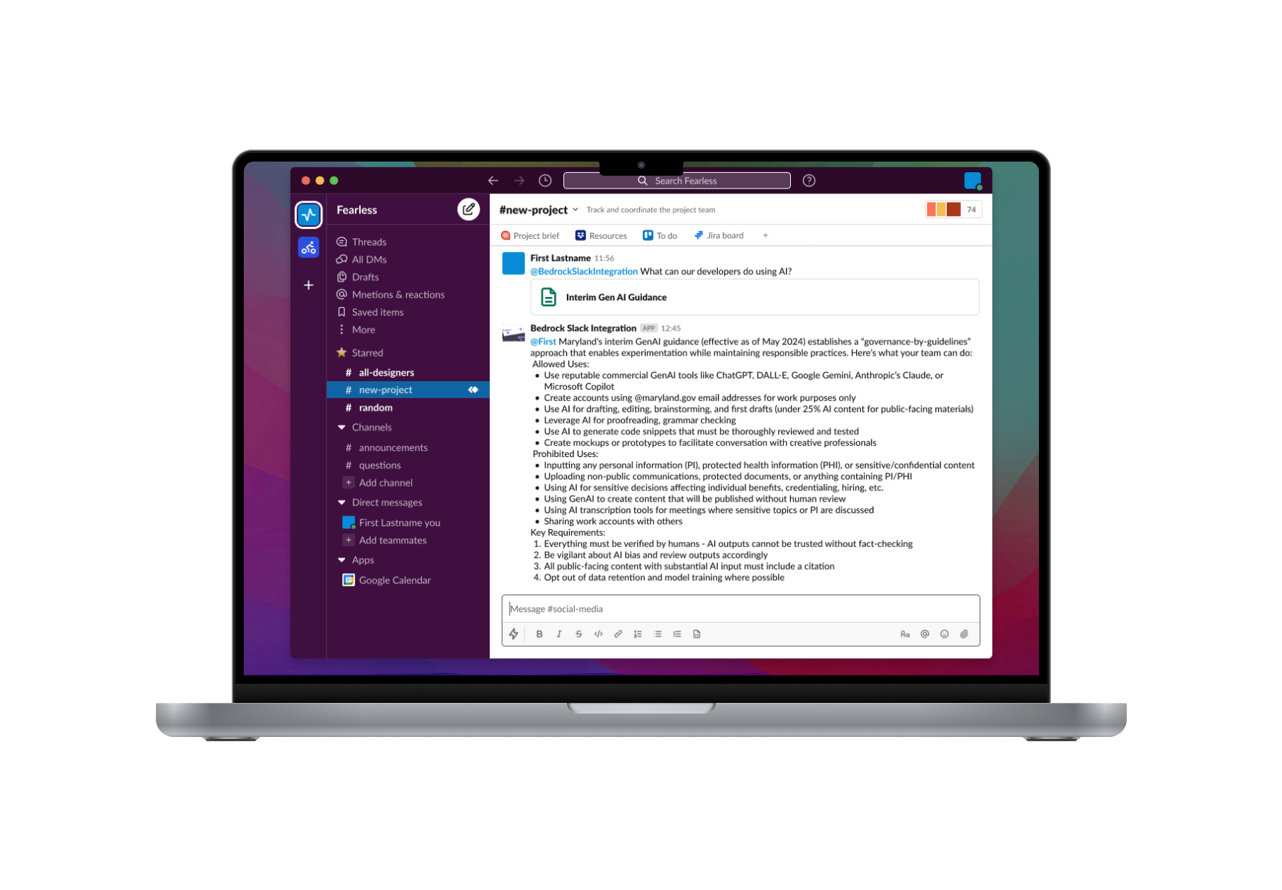
We designed and prototyped a Slackbot that streamlines project onboarding, delivering document summaries and task liststhat help our team find the right information at the right time. Our project tied for third in the 2025 Fearless Purple Hackathon despite an unfinished body of work.
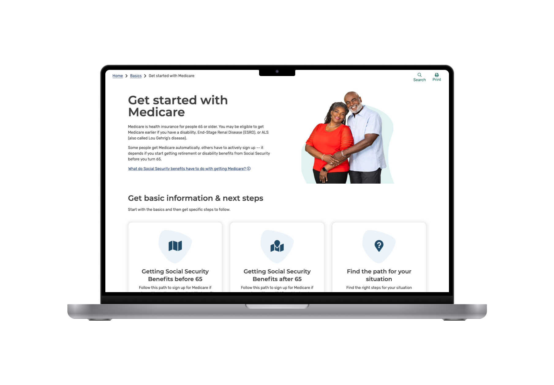
We created customized views of coming of ager journeys to Medicare based on their scenarios. Our improvements resulted in improved access to Medicare applications, improved customer satisfaction, and more personalized guidance.