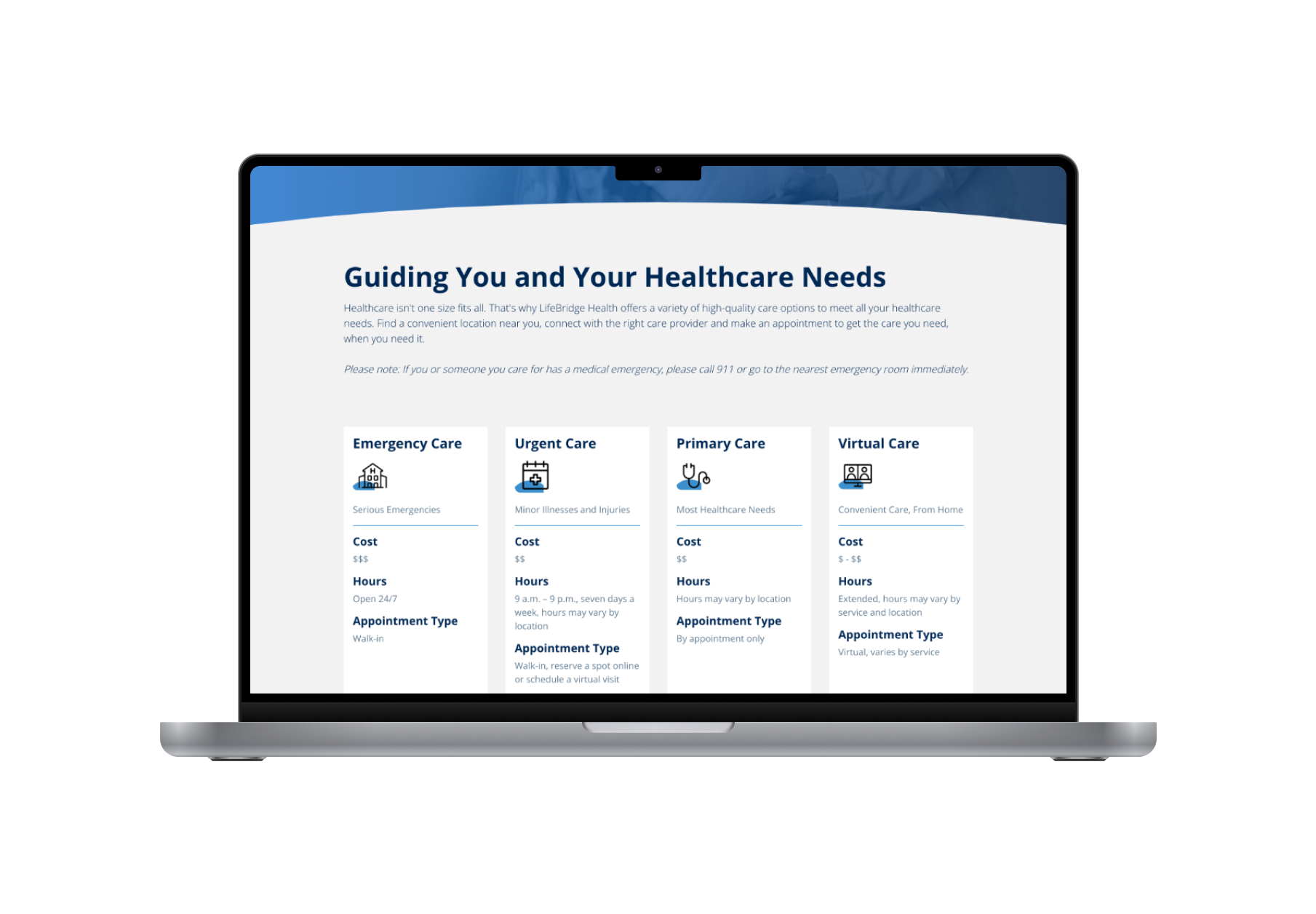
Logo
Tony Vergara
Center for Medicare & Medicaid Services

Improving Medicare sign up processes for new beneficiaries

We created customized views of coming of ager journeys to Medicare based on their scenarios. Our improvements resulted in improved access to Medicare applications, improved customer satisfaction, and more personalized guidance.

Data-Informed Decision MakingProject ScopingStakeholder ManagementPrototypingExperience Measurement & Optimization
Improving Medicare sign up processes for new beneficiaries

Help Clarify the Sign Up Process for Medicare

Through our discovery and user research with the Medicare.gov team, we identified that users were making hasty and ill-informed decisions about their Medicare benefits due to a confusing and disjointed experience navigating between CMS and the VA sites. The lack of information led to confusion and delayed enrollments, resulting in penalties and, in some cases, the loss of potential benefits altogether.

My team worked with CMS to address these pain points by reimagining critical paths within Medicare.gov for new beneficiaries, particularly the "Get Started with Medicare" section. We redesigned the user experience to clearly outline the next steps for Medicare enrollment, tailored to each user's specific enrollment scenario.

My Role

Design Lead, responsible for delivery and stakeholder coordination

Project Context

Work took place over the course of one year and our work launched on Medicare.gov before Open Enrollment 2023

Some Buzzwords We Used

Discovery, Design Leadership, Customization,

Our Process

1

We conducted preliminary desk research

Before starting, we identified topics to address by reviewing call center feedback, previous research, and web analytics to gain a well-rounded understanding of new beneficiaries. This early research helped us prioritize key areas for improvement.

2

We met for kickoff with the involved teams

We were initially tasked with improving the web experience for a coming of ager who is getting started with their Medicare benefits using Medicare.gov. We started our work with a collaborative, cross-functional kickoff meeting that brought together multiple stakeholders to collect the disparate business requirements across the impacted teams.

3

We determined project size and scope

At the start of the project, we quickly learned that improving Medicare’s sign-up experience would require us to make changes across multiple steps rather than just focusing on one area. Working with stakeholders, we mapped out the user journey to find where people struggled the most—mainly with finding their way on the site, feeling rushed about enrollment, and not knowing what happened after submitting their application. We worked through these issues one at a time, starting with the areas that had the most visibility and impact. The process was collaborative, allowing us to adjust the project scope along the way to match what stakeholders were comfortable with.

4

We drafted problem statements and user requirements

As we aligned on our problem size and scope, we used problem statements and user requirements as a way to ensure alignment with our stakeholder team on whether we were taking on the correct size of work. Our problem statements and user requirements were intentionally missing potential solutions, so that we stayed open to all of our potential possibilities instead of biasing ourselves toward the expected outcome.

5

We created designs in partnership with our content team

We collaborated closely with the content team to define messaging and templates utilizing available components. With the approved content from the [CSG], we created mockups using the CMS Design System UI kit and documented any places we strayed from out-of-the-box implementation for stakeholders, especially as some were often averse to change. Our designs underwent several review cycles to ensure alignment and clarity, and documentation played a crucial role in maintaining the usability of our outcome.

6

We tested our designs

Working with CMS' Division of Research, we gathered usability data for our new mockups (and wireframes for earlier stage testing). With findings from user research, we could assess the usability of our ideas and resolve conflicts over design direction, leading to revisions that ensured our solutions met user needs.

7

We built a roadmap for iterative improvement

To move the work forward, we accepted some compromises requested by leadership and tracked outstanding UX debt. We documented these areas in a spreadsheet of future improvements so we can address them as capacity allows.

Project Outcomes

Awareness

Get Started 2.0 Landing Pages

We redesigned the Get Started with Medicare landing pages to highlight the differences in user journey depending on when someone decides to sign up, since those who wait until after 65 to retire automatically receive Medicare benefits..

The main landing page includes links to paths for those who get enrolled automatically and those who don’t, as well as a catch all for those who might have unique circumstances that dont neatly map to those options.

Get Started Landing Pages
Decision

Ready to Sign Up

We designed a wayfinding page to guide people who are eligible to sign up for Medicare to the various places to apply, based on the scenarios that dictate their enrollment period. Some enrollment scenarios require users to fill out a DocuSign version of a paper application, while even some others required a fully manual approach.

In this work, we made more paths toward Medicare enrollment available/visible, and saw customer satisfaction rated on this page among people looking to sign up for Medicare increase by 36%.

Medicare Ready to Sign Up page
RTS Testimonial
Post-Enrollment

Medicare Parts A & B Confirmation Page

Our team built a page to confirm that beneficiaries have successfully applied for Medicare and give them next steps so that they can proactively begin searching for the right plan for their needs while they wait for a decision on their application.

This initiative required collaboration with SSA, since the actual application for Medicare Parts A & B is actually hosted on SSA.gov. We designed within their DS using HTML prototyping.

92F24E02-C80F-4585-A8B5-ED87296F006D

Accomplishments

Our work contributed to a 15-24% increase in customer satisfaction for new Medicare beneficiaries