Logo
Tony Vergara
LifeBridge Health

Redesigning a regional health system website as digital gateway to patient care

We partnered with our client to design a digital front door that simplifies patient access and reduces the barriers to proper care. We also consulted on building a data-informed CX practice across the entire hospital system.

Redesigning a regional health system website as digital gateway to patient care

Create the Foundation for the Digital Front Door

Understanding that the website should serve as the entryway to the rest of their services, whether digital or not, the LifeBridge team partnered with R2i to design a modern, modular website that facilitates optimization efforts for the customer experience.

We partnered with our client to unify all digital touchpoints into a seamless "Digital Front Door" experience, making it easier for patients to find and access the care they need, while also supporting goals like reducing ER wait times. We created a flexible information architecture and content strategy to address diverse service models and guide users seamlessly across multiple hospitals, each with unique offerings. We helped the marketing team develop their customer experience (CX) practice, integrating user research, data analytics, and session replay, so our client could be more proactive in their efforts to improve the user experience for all site visitors.

My Role

Lead UX Strategist, leading a team of three (two strategists, one designer)

Project Context

4 months

Some Buzzwords We Used

User survey, user interviews, project management, team leadership, sitemapping, workshop facilitation

Our Process

1

We hosted a collaborative kickoff meeting

We conducted a kickoff and intake session with the LifeBridge Health team to get a better understanding of their priority goals for the website and any pain points they face in website content management.

In this kickoff session, we quickly learned that we would need to align the stakeholders internally along the way to the new website, since there were many different viewpoints (and more importantly, opinions) about how the website should function.

To ensure we took a data-informed (not data-driven!), insights-driven approach to deciding general structure issues, we identified the data the team had available to make decisions for their web content, discussed current processes from initial concept to live content, and explored the available features and functionality for use within their current content management system.

2

We proposed a strategy for user research, including operations

The team wanted to build quickly, but we knew we needed to conduct thorough research for our proposals to be convincing to the various department heads, hospital leadership, and business folks.

We proposed an Agile research plan, allowing for research opportunities at every stage in the design and build process, and included a detailed schedule that demonstrated to our stakeholders that we could do more research in the same timeframe, all on the same budget.

Accomplishment: Through our UX Research Plan, we were able to broaden the scope of the initially proposed research to include heatmapping, conduct both interviews and surveys, and include multiple types of summative UX research activities for validation beyond usability testing of the wireframes; all within the same budget.

3

We conducted discovery research to understand the current state and identify future opportunities

To understand how the hospital's business goals translate throughout the different departments, we conducted 8 stakeholder interviews across various departments in the hospital, such as legal, medical leadership, department heads, and HR/Talent. Once the interviews were complete, we presented a summary of findings from the interviews grouped by theme.

While we were conducting those stakeholder interviews, our team was also reviewing literature on hospitals undergoing digital transformation, performing analytics reviews, conducting competitive analyses, carrying out accessibility audits, SEO audits, content analyses, and performance audits using Lighthouse.

4

We improved the data collection methods available on the current site

To provide more data for decision-making on the website strategy, we improved the data collection methods on the current site by adding Hotjar, implementing Google Analytics quick wins, and getting a survey tool. With those new tools, we identified initial metrics to quantify the customer experience.

5

We shared findings from our discovery with stakeholders.

6

We Developed a Content Model, Including a Sitemap and Content Inventory, in Order to Organize Information Effectively

7

We Created a Component Library in Order to Ensure Consistency and Efficiency in Design

Within each page of the content inventory, we wanted to ensure consistency in user experience and efficiently manage the content. This led us to document all of our available components and usage guidelines for each so that any editor across the organization could easily update the pages they manage with minimal guidance from the marketing team.

8

We supported content migration through automation

We provided content migration support using BeautifulSoup to automatically collect the formatted content directly into the briefs and gather assets.

9

Validation through Usability Testing

Once we had a proposed sitemap and wireframes, we conducted usability testing to assess findability and usability of the new website experience.

Our testing process included multiple smaller tests targeted around prior website pain points, running unmoderated testing in a mixed between-within subjects study design using Maze to collect data quickly.

  1. Can users find information using the navigation? (tree testing)
  2. Can users understand the page layouts and content? (wireframe usability testing)
  3. Do users feel the new visual design reflects the desired brand reputation? (5-second, first-click, and A/B testing)

Project Outcomes

UX Strategy

Presenting the Discovery Summary & Key Strategies

We used our discovery findings summary as a way to brief any new stakeholders that joined the team on the problems we were looking to solve and highlight the user data that led to the decision.

discovery summary deck cover
Patient persona
Recommendation slide: Design system
Sitemap proposal slide
Information Architecture

Building a Consolidated System-Wide Website Hierarchy

To aid the LifeBridge Health team in updating their content as we go through the process of redesigning their website, we drafted documentation around how to implement a holistic content strategy around content structure, governance, and workflows, with special consideration for ongoing maintenance in preparation for re-platforming to a more flexible enterprise content management system. We created the following templates to get the team started on content gathering in parallel with the website redesign:

Sitemap Framework

We built a main sitemap that housed the entire range of hospital-system-wide content and prepared a reusable, scalable framework for each service line within to organize content in a consistent structure that fits within brand guidelines for style, voice, and tone. In preparation for a sitemapping workshop with the client team and better understand the current state of the site's content, we built a prior state sitemap of each set of folders we could identify and organized it to create an intuitive hierarchy as close to the current organization as we could. With this information, we noticed themes/patterns emerge around content organization for a large number of the service lines and locations that just kept basic content, while others ignored that structure entirely and presented their content in a flat structure with no hierarchy or intuitive groupings.

Content Inventory & Briefs

Using the list of pages identified during the site crawl, we created a document to facilitate auditing the website content and keep track of each page from initial ideation to publishing within the CMS.

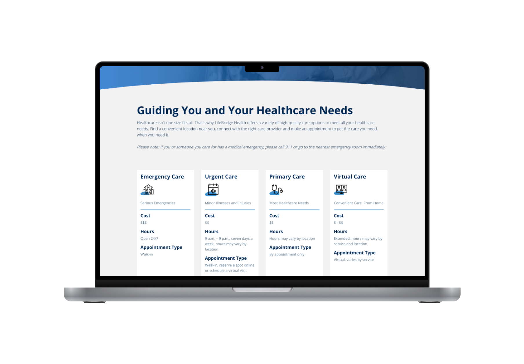
Each page should have an associated content brief, outlining the specific content for the page, the relevant tags and metadata, the page template, components needed, and any other information needed by the development team as they populate the content into the content management system.

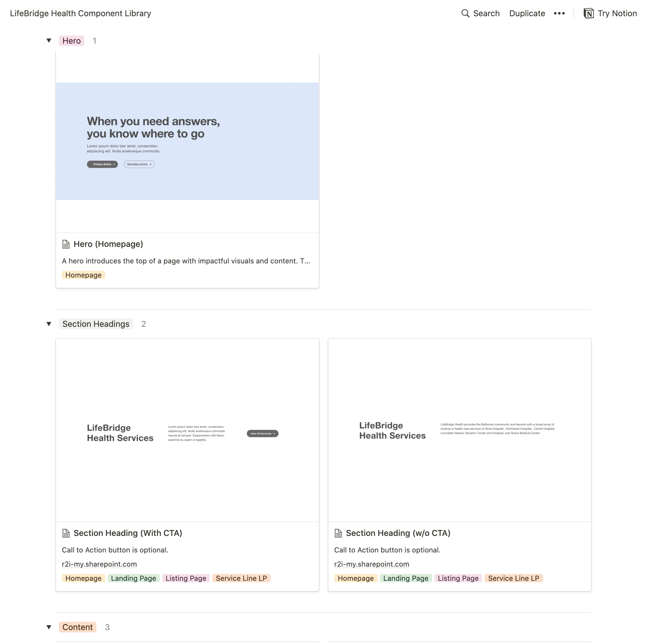
Component Library & Component Authoring Guide

For each component we've designed, we created guidelines that educate the authoring team on the necessary info and content restrictions to ensure consistent standards are being applied across the website, regardless of the author. This allowed the LifeBridge marketing team to scale their team of content authors without sacrificing quality.

Planning for Design System: this site requires a design system due to its size and disparate ownership, so all of the work done to date is intended to get their team started on formalizing a design system as the site plans for migration to Drupal.

LifeBridge Component Library
User Research

Validation through Usability Testing

Once we had a proposed sitemap and wireframes, we conducted usability testing to assess findability and usability of the new website experience.

Our testing process included multiple smaller tests targeted around prior website pain points, running unmoderated testing in a mixed between-within subjects study design using Maze to collect data quickly.

  1. Can users find information using the navigation? (tree testing)
  2. Can users understand the page layouts and content? (wireframe usability testing)
  3. Do users feel the new visual design reflects the desired brand reputation? (5-second, first-click, and A/B testing)
Usability Test Build Sample
Website Designs

A Refreshed Website

We redesigned the website with a focus on scannability and navigation.

Our new designs made the content more scannable by strategically incorporated whitespace to guide user attention throughout the page, reducing visual clutter and enhancing readability. We also utilized scrolling to create a more immersive and engaging experience, allowing users to discover content at their own pace, instead of being overwhelmed by all of the content at once. This resulted in adopting a modular, component-based format for content displays. This approach enhanced reusability across the site, streamlined future updates, and ensured consistency in design and functionality across the entire website.

We enhanced content navigation by chunking longer lists into more digestible sections and implementing fewer, more focused calls to action. Additionally, we visualized the various options for medical care—emergency, urgent care, telemedicine, GP visits, and specialist visits—empowering users to easily select the right service based on their specific needs. This thoughtful approach not only streamlined the user experience but also facilitated informed decision-making in a critical area of healthcare.

Initially, stakeholders were hesitant to approve our new designs, as they were accustomed to the traditional approach of cramming content above-the-fold. To address their concerns, we presented documentation of current design best practices and shared current site heatmaps as well as insights from our user interviews. This evidence demonstrated that users are more likely to scroll than previously thought, and that our new approach would encourage deeper engagement with the site's content.

lifebridge-before_after.png
Locations-LifeBridge-Health
Find-Care-Now-LifeBridge-Health