Through our initial usability audit, we reviewed each page of current site content for recommendations to include in the pattern library.
Website Style Guide
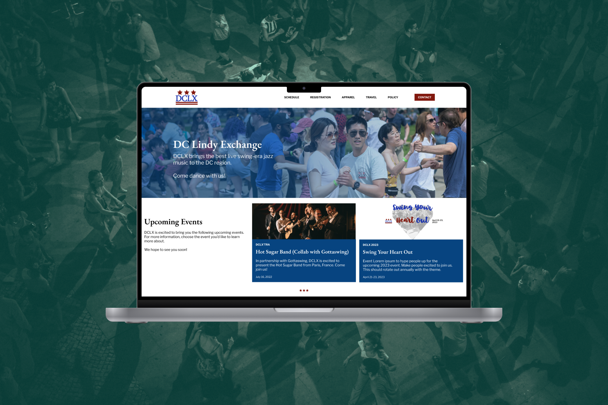
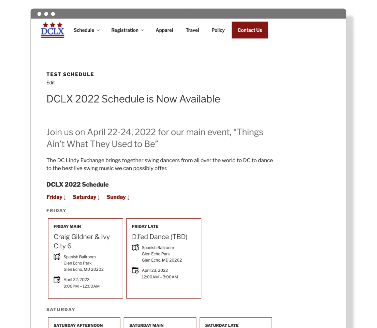
To update the overall content layouts and standardize header and button styles and understand the current styles and utilities, we imported the current website's CSS stylesheet into our home-built style guide tool. Previous content authors had not utilized header and button styles in their content, deferring to bold tags for headings and text links for all calls to action within the page body.
Our style guide is intended to build consistency into the component selection and copy and provide a framework to onboard other authors to the website team.
Build a Pattern Library
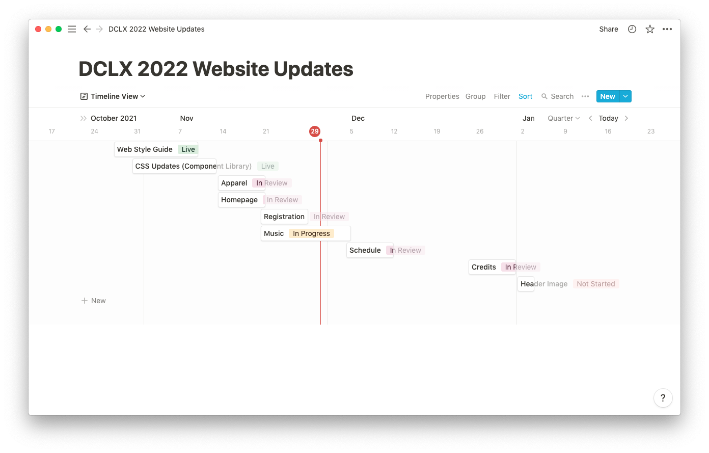
We augmented our web style guide to include a pattern library that included 5 new components. The current website includes an open HTML text editor, so our pattern library can only currently be used by someone with HTML expertise. Once we completed each component within the pattern library, we staged the component(s) on a test page and added the CSS required into Wordpress to style the new components for QA and internal review. As components were approved, the CSS was pushed to production and the component was now available for use in preparation for the next event.
Adding Brand Guidelines
We are currently adding brand guidelines to our style guide to build a more cohesive set of brand standards throughout our entire customer experience. These brand standards should guide the website design, social media designs and copy, and newsletter design.